Engaging experience through Rewards
How might we apply an e-commerce experience to a telco purchase journey? In this case study, we examine the possibility of using a Rewards feature to enhance the telco's internet purchase journey and lifestyle offers.
My Role
UX Lead, Research, Visual Design, User Journey, Design System
Industry
Telecommunication
Year
2021 - 2022


Problem Analysis
The Hotlink app is essentially a mobile application used to manage mobile phone plan - which is a prepaid brand under Maxis Broadband, a telco company in Malaysia.
Who are the users?
The app users consists of Hotlink prepaid and postpaid customers actively use the app to manage their accounts and seek benefits like free data, discounts, or exclusive offers.
What is the opportunity here?
Data findings have shown, despite the high amount of points claimed daily from users, the app only saw 20% of points being redeemed at merchants.
Why this project?
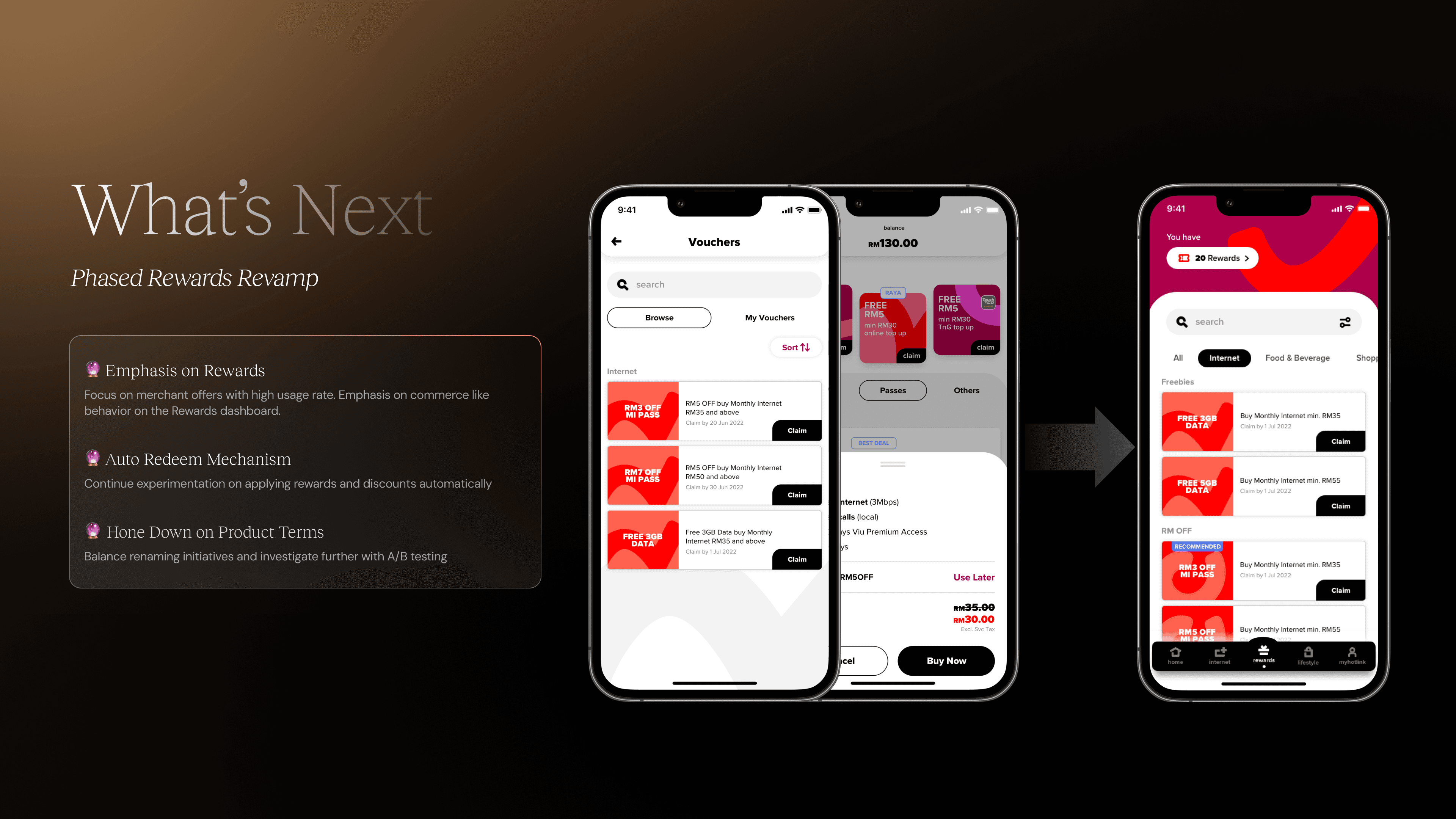
The existing rewards system was designed to give Hotlink prepaid users with daily reward points and mystery gift. With the increase of monthly internet plan subscribers, we have been seeing a downward trend in the app's active usage time. The app would need to reframe Rewards feature to remain relevant. We need to evaluate the feasibility of delivering simple e-commerce use cases based on the first MVP of voucher concept.

Information Architecture
The navigation and entry points remain close to the app's existing IA to ensure the app performance remain optimal. The voucher feature would sit within several parts of the app. This includes a commerce journey, where users are purchasing passes from the 'Internet' page. For a full version of the feature, the Rewards page would provide users a comprehensive access to browse/search/filter and claim vouchers. Users could also view their Vouchers from Settings page as an alternative.
Wireframe
I explored various ways to design an attractive and familiar UI that consists of new or existing components from the design system library. Some of my considerations evolve around Card components, Category display, Search / Filter entry points and branding UI.
How to best display new and claimed vouchers?
How to best display offers, deals in various interface?
How to best display Search function?
How to best display Sorting function?
How to best display illegible Voucher offers? Disable/Not display at all?
How to best display success prompts?
For the the first MVP, the design features a simple layout between two tabs of new or claimed vouchers. Furthermore, an entry point for adding Voucher is displayed as a row during checkout details before customers would confirm their purchase.


User Testing Research
Journey 1: As a user, I would like to purchase Internet Pass,
and use a voucher for the first time.Journey 2: As a user, I would like to browse Vouchers and renew my internet plan with negative scenario.
Terminology
Are users able to differentiate between the content terminologies such as Vouchers, Rewards, e-voucher, MU offers and lifestyle?
Usability
Are users able to successfully identify entry points? Visibility of entry point
‘Browse’ and ‘My Vouchers’ Tab, Auto apply recommended voucher, Return to previous step journey
Accessibility
How convenient did users find the journey to claim and browse Vouchers?
Intention
How well perceived is the e-commerce feature for telco users? Would users approach it with a need-based or claim-all-you-can mindset?
Findings
New approach to introducing Voucher & optimising user accessibility is generally well-liked by all users. Users are inclined with auto-apply during their purchase journey.
All participants completed their tasks from the main, positive, negative, and alternative journeys.
The navigation process was considered straightforward. The information is sufficient and easily understood. Majority of users prefer to land on 'Browse' and explore their options before viewing what vouchers they have claimed.
The application requires additional clarification to address the ambiguity surrounding product naming.
Look & feel with attractive and trendy design – matches the brand's expected theme.
Outcome
205% Claims increased in a quarter
The feature reached the highest claim which increased 205% from the previous quarter.
13% Voucher usage increased
Since the launch of Voucher in this year, we saw a high engagement with over 800K being claimed daily, with a 13.5% usage rate from the initial 7%.